Prints are defined as repeating or singular graphic motifs applied to fabric, and understanding how prints work in casual outfits is the single most useful styling skill you can develop. The industry term for the practice of wearing multiple prints together is print mixing, and it follows clear visual rules rather than guesswork. Get those rules right and your casual wear gains texture, personality, and depth. Get them wrong and the result is visual noise. This guide covers the foundational principles, scale and texture dynamics, beginner strategies, and the most common pitfalls, so you can build print outfits with genuine confidence.
How do prints work in casual outfits: the basic principles
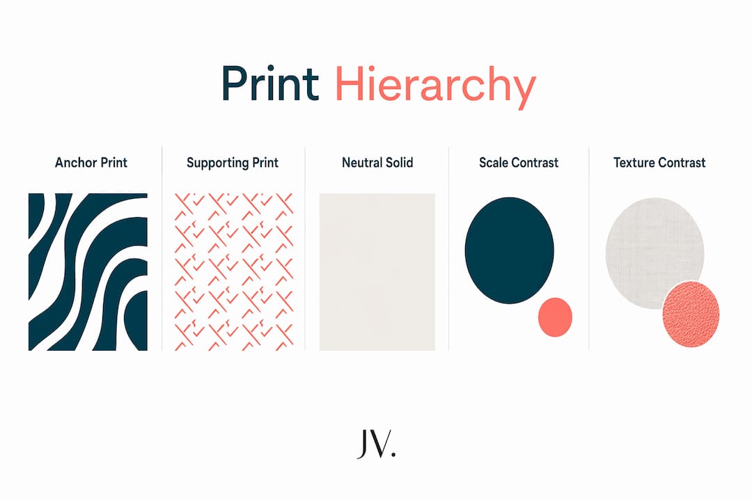
Print mixing in casual wear follows a three-part hierarchy: one dominant anchor print, one secondary supporting print, and one neutral piece that gives the eye a place to rest. The anchor print is your statement, typically the largest or most colourful pattern. The supporting print is smaller or quieter, and the neutral piece, think denim, black, or beige, ties everything together without competing.
Colour cohesion is the mechanism that makes this hierarchy work. When two prints share at least one colour, the eye reads them as intentional rather than accidental. Experts recommend limiting your palette to 2–3 core shades across all pieces in the outfit. That constraint sounds restrictive, but it actually gives you more freedom because every piece you own in those shades becomes a potential combination partner.
Scale contrast is the third pillar. Pairing a large-scale print with a small-scale one prevents the two patterns from fighting for attention. Different print families combine well when they share a common colour and maintain clear scale contrast. A wide floral paired with a fine stripe works precisely because neither pattern occupies the same visual frequency.
- Anchor print: the dominant, largest, or most colourful pattern in the outfit
- Supporting print: a smaller or quieter pattern that complements rather than competes
- Neutral piece: a solid in denim, black, white, or beige that provides visual breathing space
- Colour rule: limit the total palette to 2–3 shades shared across all printed pieces
- Scale rule: always pair a large print with a small or micro print
Pro Tip: Start with two prints before attempting three. Two is manageable; three requires a confident eye for colour and scale.
How do print scales and textures influence outfit harmony?
Scale is the most misunderstood variable in print styling. Large-scale prints, such as oversized florals or bold geometric blocks, carry strong visual weight. Micro-prints, such as fine ditsy florals or tiny polka dots, carry almost none. That asymmetry is exactly what makes them work together.
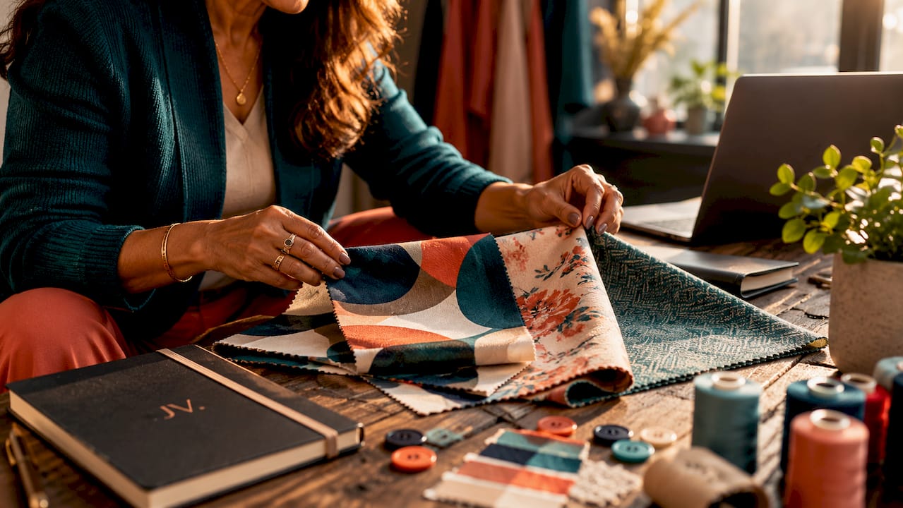
Micro-prints appear as textured solids from a distance of 2–3 metres, supporting macro-print statement pieces without overwhelming the eye. This optical effect is central to balanced print layering. A micro-print blouse worn under a large floral midi dress reads as a tonal layer up close and as a clean solid from across the room. You get depth without chaos.
Fabric texture adds a third dimension that most guides overlook. Pairing smooth, shiny fabrics with matte, heavier ones creates depth beyond what colour and scale alone can achieve. A silk-feel paisley top worn with a cotton printed skirt prevents the outfit from appearing flat or chaotic. The contrast in surface quality separates the two prints as clearly as a colour difference would.
- Choose your anchor print first. Select the piece with the largest or boldest pattern and build everything else around it.
- Add a micro-print layer. Choose a fine pattern in a fabric that contrasts texturally with your anchor piece.
- Introduce a neutral. Add a solid piece in denim, black, or white to give the eye a rest between the two prints.
- Check the palette. Confirm all three pieces share at least one colour before leaving the house.
- Step back and look. View the outfit from across the room. If the micro-print reads as a textured solid, the balance is right.
| Print combination | Scale contrast | Texture contrast | Result |
|---|---|---|---|
| Oversized floral + fine stripe | High | Low | Works with shared colour |
| Bold geometric + ditsy floral | High | Medium | Strong, intentional look |
| Silk paisley + cotton check | Medium | High | Depth through texture |
| Two medium florals | None | None | Visual noise, avoid |
Pro Tip: A balanced capsule wardrobe should include around 30% micro-print or textured pieces. They act as the quiet supporting cast that makes your statement prints shine.
What are practical strategies for beginners to start styling prints?
The fastest way to build confidence with print mixing is to remove colour from the equation entirely. Starting with black-and-white patterns lets you focus purely on scale and direction without worrying about whether shades clash. A black-and-white stripe paired with a black-and-white floral is a low-risk, high-impact combination that works every time.
Familiar silhouettes reduce the perceived boldness of prints and increase your comfort level when wearing them. If you always reach for a straight-leg trouser or an A-line dress, start your print journey in those exact shapes. The silhouette you trust acts as an anchor, so the print feels like an addition rather than a costume. You can read more about how silhouette shapes confidence in everyday dressing.
- Begin with one printed piece. Pair a printed top or skirt with solid separates to ease into the look without committing to full print mixing.
- Use black-and-white prints first. Monochrome patterns simplify coordination and build your eye for scale contrast.
- Stick to your trusted silhouettes. Wear prints in shapes you already love to keep the look feeling natural.
- Add printed accessories before printed clothing. A printed scarf or bag introduces pattern without requiring a full outfit rethink.
- Build a mini print capsule. Choose one anchor print, one micro-print, and two solid neutrals. Those four pieces create multiple outfit combinations.
Print placement also matters more than most people realise. Fabric is cut from continuous rolls, which means the exact position of a print on a garment varies between pieces. When shopping for printed clothing, check where the motif falls on the body, particularly across the bust or hips, before buying. Two identical dresses can look quite different depending on where the print lands.
How can you create versatile casual outfits by combining prints with solids?
Prints work best when anchored with solids or denim rather than worn as isolated statement pieces. That approach avoids a costume-like effect and keeps the overall look grounded. A printed midi dress worn with a plain denim jacket, for example, reads as a considered casual outfit rather than a fancy-dress attempt. The solid layer does the heavy lifting of making the print feel wearable.
Colour repetition between your print and your accessories is the simplest way to create a cohesive look without overthinking it. If your printed top contains rust orange, wear rust earrings or carry a rust bag. The repeated colour signals intention and pulls the outfit together. You can explore everyday outfit formulas that use this exact principle across different casual looks.
- Print + solid trouser: a printed blouse with wide-leg trousers in one of the print’s colours creates an effortless daytime look
- Print + denim: a floral midi dress under a denim jacket is the most reliable casual formula in print styling
- Print + cardigan: layering a printed dress under a plain cardigan softens the look and adds warmth without hiding the pattern
- Print + solid accessories: repeat one colour from the print in your shoes or bag to tie the outfit together
- Two prints + one solid: use the three-part hierarchy with a neutral solid as the anchor piece rather than a printed one
| Outfit formula | Anchor piece | Supporting element | Neutral |
|---|---|---|---|
| Floral dress + denim jacket | Floral midi dress | Denim jacket | White trainers |
| Printed blouse + wide-leg trousers | Printed blouse | Trousers in print colour | Nude sandals |
| Stripe top + floral skirt | Floral skirt | Stripe top | Black belt |
| Printed set + plain cardigan | Printed co-ord set | Plain cardigan | White trainers |
What are common pitfalls in mixing prints and how can you avoid them?
The most frequent mistake in print mixing is combining two prints of the same scale. When two patterns occupy the same visual frequency, neither one wins and the result is visual noise. The fix is straightforward: always ensure one print is noticeably larger than the other. If you hold two pieces next to each other and cannot immediately tell which pattern is dominant, swap one for a solid.
Overloading on colour is the second most common error. Wearing three prints that each introduce a different colour palette creates an outfit that reads as chaotic rather than creative. The 2–3 colour rule exists precisely to prevent this. Every print in your outfit should share at least one shade with the others.
- Avoid same-scale prints. If two patterns are similar in size, the eye cannot prioritise one over the other.
- Do not mix more than three colours. More than three shades across your prints creates confusion rather than character.
- Let one print dominate. The anchor print should always be the most visually prominent piece in the outfit.
- Swap a print for a solid when in doubt. If the look feels too busy, replace the supporting print with a plain piece in one of the shared colours.
- Check fit before committing to a bold print. A poorly fitted garment in a bold print draws attention to the fit problem rather than the pattern.
Pro Tip: Lay your outfit flat on a bed before wearing it. Seeing all the pieces together without your body in them makes it far easier to spot colour or scale clashes before you leave the house.
Key takeaways
Successful print mixing relies on a clear hierarchy of scale, colour cohesion across 2–3 shades, and at least one solid neutral to anchor the look.
| Point | Details |
|---|---|
| Use a three-part hierarchy | Combine one anchor print, one supporting print, and one solid neutral for every outfit. |
| Match scale, not just colour | Always pair a large-scale print with a micro or small-scale print to avoid visual noise. |
| Add texture contrast | Mix smooth and matte fabrics to add depth beyond colour and pattern alone. |
| Start simple | Begin with black-and-white prints or one printed piece paired with solids to build confidence. |
| Repeat colour in accessories | Echo one shade from your print in your shoes or bag to create a cohesive, intentional look. |
Why prints changed how I think about casual dressing
I spent years treating prints as special-occasion items, something to pull out for a holiday or a party and then hang back up. The shift came when I stopped thinking about prints as statements and started treating them as textures. Once you see a micro-floral blouse as a textured neutral rather than a bold choice, the whole wardrobe opens up.
The most underrated lesson I have learned is that confidence with prints comes from repetition, not from having a perfect eye. You wear a floral midi dress with a stripe top once, it feels slightly wrong, you adjust the scale next time, and gradually your instincts sharpen. Nobody gets it right immediately. The people who look effortless in mixed prints have simply made more mistakes than everyone else.
Prints also tell a story about who you are in a way that solid colours simply cannot. A vintage-style floral, a graphic geometric, a classic stripe: each one communicates something before you say a word. Building a casual wardrobe around prints you genuinely love, rather than prints you think you should wear, is the fastest route to a style that feels like yours.
— Mykola
Jvwear’s print-forward pieces for your casual wardrobe
Putting these principles into practice is much easier when the pieces themselves are designed with versatility in mind.
Jvwear’s button-front cardigan midi set is a ready-made example of the anchor-plus-neutral formula: a printed dress paired with a plain cardigan that doubles as a layering piece. The cardigans collection offers solid layering options in neutral shades that work directly over printed dresses and sets. For a statement anchor print, the vintage floral maxi dress in cotton-linen blend gives you a large-scale print with natural texture contrast built in. Complete the look with a sculptural clutch bag that echoes the colour palette without adding another competing pattern.
FAQ
What is the easiest way to start mixing prints?
Start with black-and-white patterns to remove colour guesswork and focus purely on scale contrast. Pair one large-scale monochrome print with one small-scale monochrome print for an immediately cohesive result.
How many prints can you wear at once in a casual outfit?
Two prints is the recommended starting point, with a third added only once you are confident with colour and scale. Each print must share at least one colour with the others to maintain cohesion.
Do prints have to match to work together?
Prints do not need to match, but they must share at least one colour. Different print families combine well when a common colour unifies them and a clear scale difference prevents visual competition.
What role do micro-prints play in casual outfit styling?
Micro-prints read as textured solids from a few metres away, making them ideal supporting layers beneath larger statement prints. They add depth without adding visual noise.
How does fabric texture affect a print outfit?
Fabric texture contrast adds a third dimension to print mixing beyond colour and scale. Pairing a smooth or shiny fabric with a matte or heavier one separates two prints visually and prevents the outfit from looking flat.